
In this article I’d like to discuss mobile bounce rates, the difference between a mobile and non-mobile website and also a brief overview on what options you have to optimise your site for mobile-friendliness.
Mobile Bounce Rates
If you have a website, which I hope that if you own a business, you do have you hopefully implemented some sort of analytics on your site to check statistics of online traffic etc. Google Analytics is probably one of the most popular tools to use when it comes to checking these type of stats. One of the most important stats to check is your websites bounce rate. The bounce rate gives you an idea how many people are leaving your website before they’ve even clearly seen your website’s message. So basically they are just opening the site and almost immediately closing in. The higher the bounce rate, the worst of your site is. This means that most of the user visiting your site are not even going past the page they landed on.
When it comes to mobile bounce rate, you need to check how many people are accessing your website via a mobile device and how high the bounce rate is. If your mobile bounce rate is too high then you have to know that something is definitely wrong and you need to consider creating a mobile version of your site.
Standard website VS Mobile-friendly website
Many website owners unfortunately don’t know the difference between the two, and think that if they can browse to their website on a mobile device and it’s showing the whole website, but just very tiny, they are home free. Unfortunately that is not the case.
The image below shows the same site on a mobile device in two different ways.
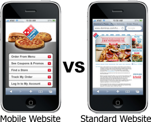
standard site vs mobile site
In Standard View:
- Website looks same as on desktop
- Site is much smaller to fit on smaller device
- Unable to read the text unless you zoom in
- The buttons are very hard to click on as they are sometimes too close to each other or too small.
Standard View Conclusion: It’s basically much harder to navigate through the website or read anything. Most user will close the website out of frustration and thus increase your mobile bounce rate.
In Mobile View:
- Website looks different from the main / standard website, but the core elements / design is still available.
- Site fits perfectly onto the smaller device screen
. - Text is bigger and kept to a minimal, decreases endless scrolling and eliminating frustration.
- Only main options are displayed, making navigation easier
Mobile View Conclusion: Site is easier to navigate and easier to read content. Increasing likelyhood of user to stay on the site.
So go and checkout your website on your mobile and see how easy it is to navigate through the site and read the content.
Another factor you need to consider for your Mobile-friendly website is speed. This could also be causing your high bounce rate. Make sure your website, mobile or on a desktop, does not take longer than 2 seconds to load.
Mobile-friendly Website options:
Here are just a couple of options for mobile-friendly websites.
- Build a Responsive Website: This means that the site will have to be rebuilt / designed and it’s probably the most costly option between them. Having a responsive site means that the site will change and appear differently depending on the device that you are using to open the site.
- Build a Mobile Version: You can also opt for building mobile version of your site and redirecting traffic depending on the device they use to access your website.
- CMS plugins – If you are using a content management system such as WordPress, Joomla or Drupal, you will more than likely be able to find a plugin that will optimise your website to be mobile-friendly.